Caulking Tools & Accessories
Tuesday morning. 10:35am. Our CEO comes upstairs to pay us a visit. In his right hand, resting between his index and middle finger, is a yellow sticky note with two handwritten words. These are two names for a caulking tool company that he has been losing sleep over for months. Both options don’t exactly roll off my tongue, but they have meaning and have been vetted and researched by the team. This is highly confidential so the sticky note will need to go back to him after our review. Welcome to the market!
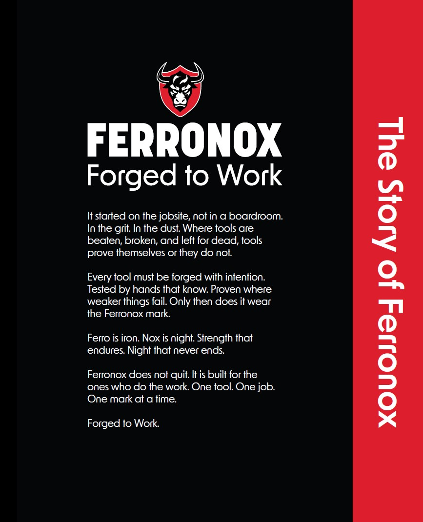
Tested by Hands That Know
The idea for this company was born on the job site, not in a boardroom. It is about high-quality tools and accessories that have proven themselves under pressure and have been tested by hands that have felt competitors’ tools fall apart and fail. To instill this narrative into all customer touchpoints, we first formalized the brand story and then used it as a beacon during the design and development process. As an established leader in commercial caulking, the founder already knew that professionals want tools that are durable and quietly confident.
Strategy
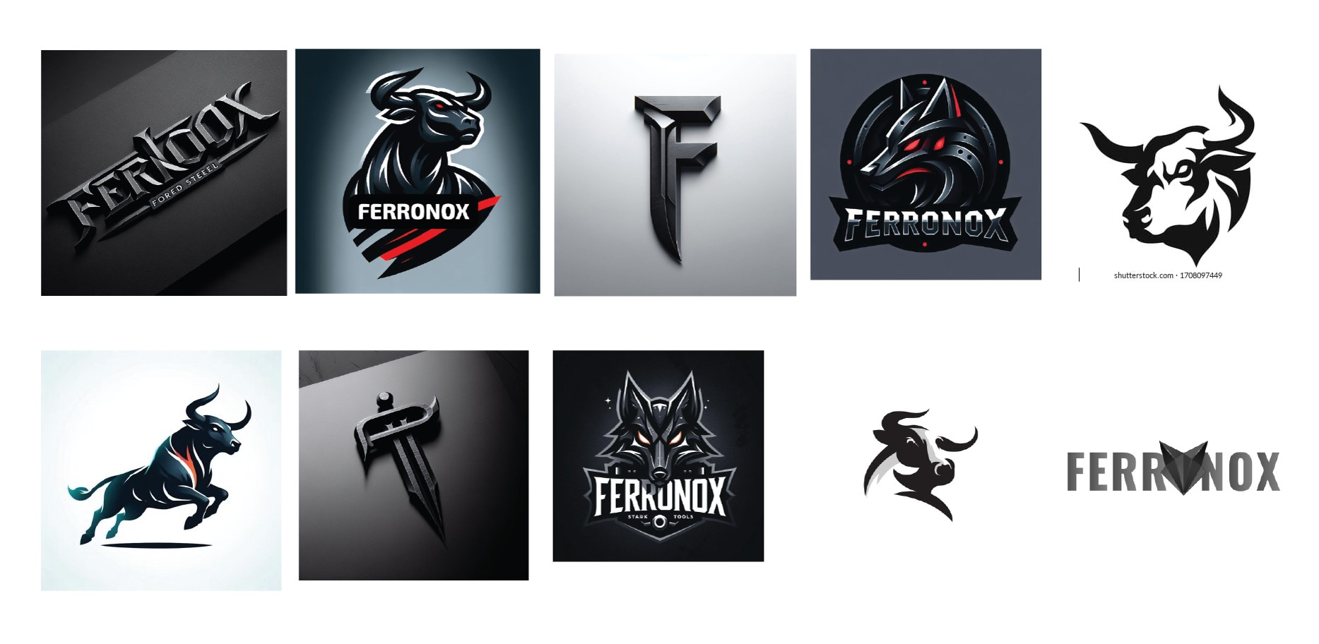
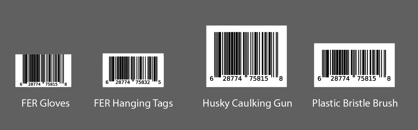
The challenge was to carve out a spot in a saturated tool market and become leaders in the niche of caulking tools. To get started, I used the brand story, logo research, and the owner’s direction to give shape to the new visual identity. Once the logo was approved and literally etched into metal, it was time to develop the packaging. The design intern and I visited a local Home Depot to understand the competitive landscape and to take note of best practices. We used this preliminary research strategy to quickly make key design decisions on details like barcode sizing and security stickers, also helping avoid any stark similarities with competitor packaging. We also leaned on a geometric font New Order to create a good contrast against the main wordmark.
The Buildings Show: The brand was finally ready for one of the biggest tradeshows of the year. To help the Marketing team focus on making as much impact as possible at the show, I proposed developing a simple landing page and postponing the full website until we had enough products in our lineup. (Photo by Anusha Ivaturi)
Leadership
As a project owner and lead designer, I directed our design intern and was responsible for the quality and accuracy of various packaging design projects. Due to a tight schedule and a large number of caulking accessories that needed packaging for upcoming tradeshows, some requirements and information such as product names were missing and that put the design intern in a state of confusion. After discovering this during our regular feedback sessions, I started releasing complete briefs that included everything necessary for the design intern to complete the project. This approach had an immediate positive effect on the designer’s morale, and also yielded an increased output.
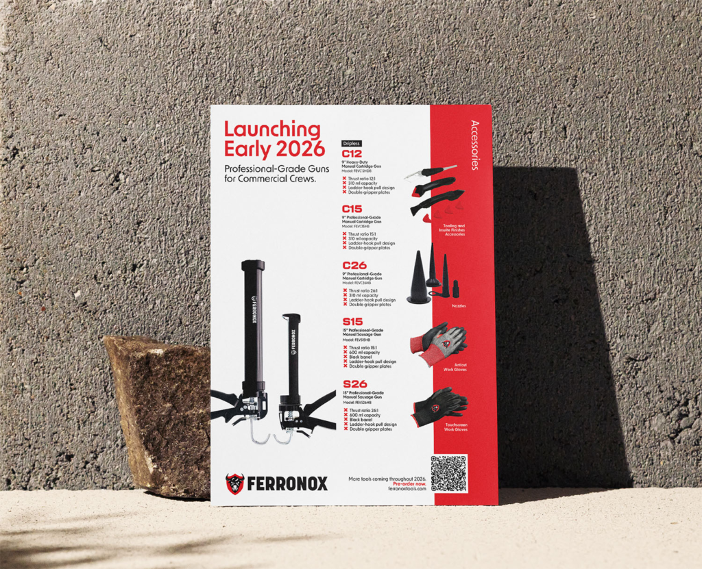
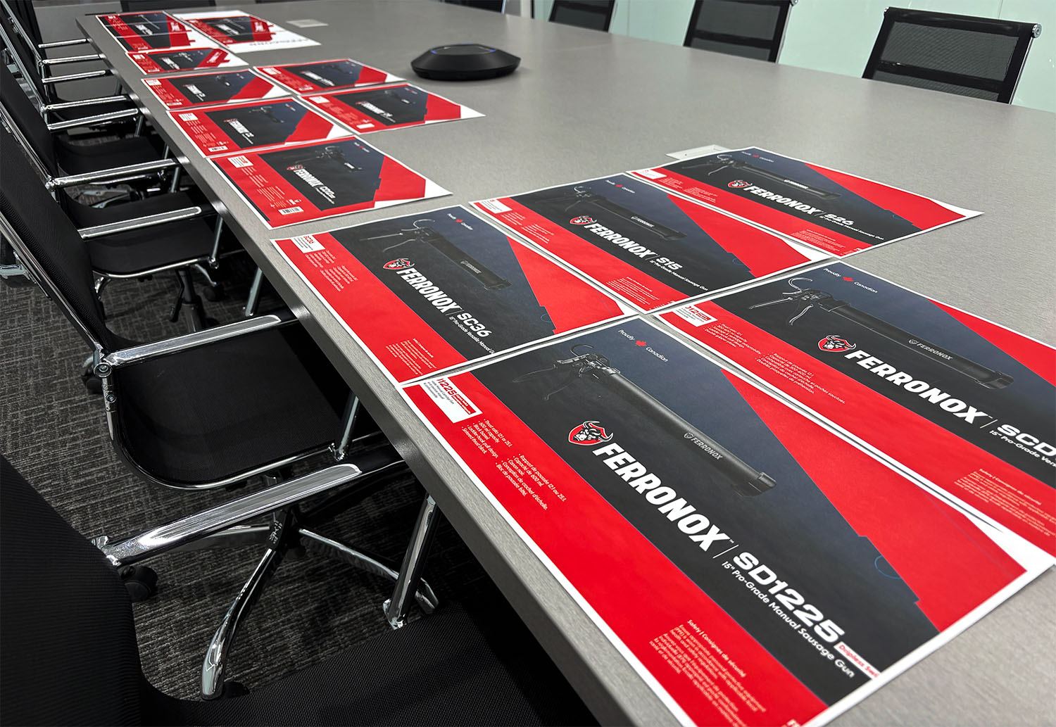
Promotional Brochure: Together with the design intern, we developed a promotional brochure for the launch of the growing lineup of caulking tools. The final piece was an amalgamation of various design elements out of the three options that were proposed.
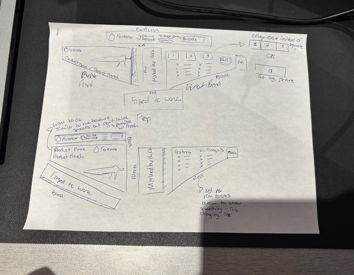
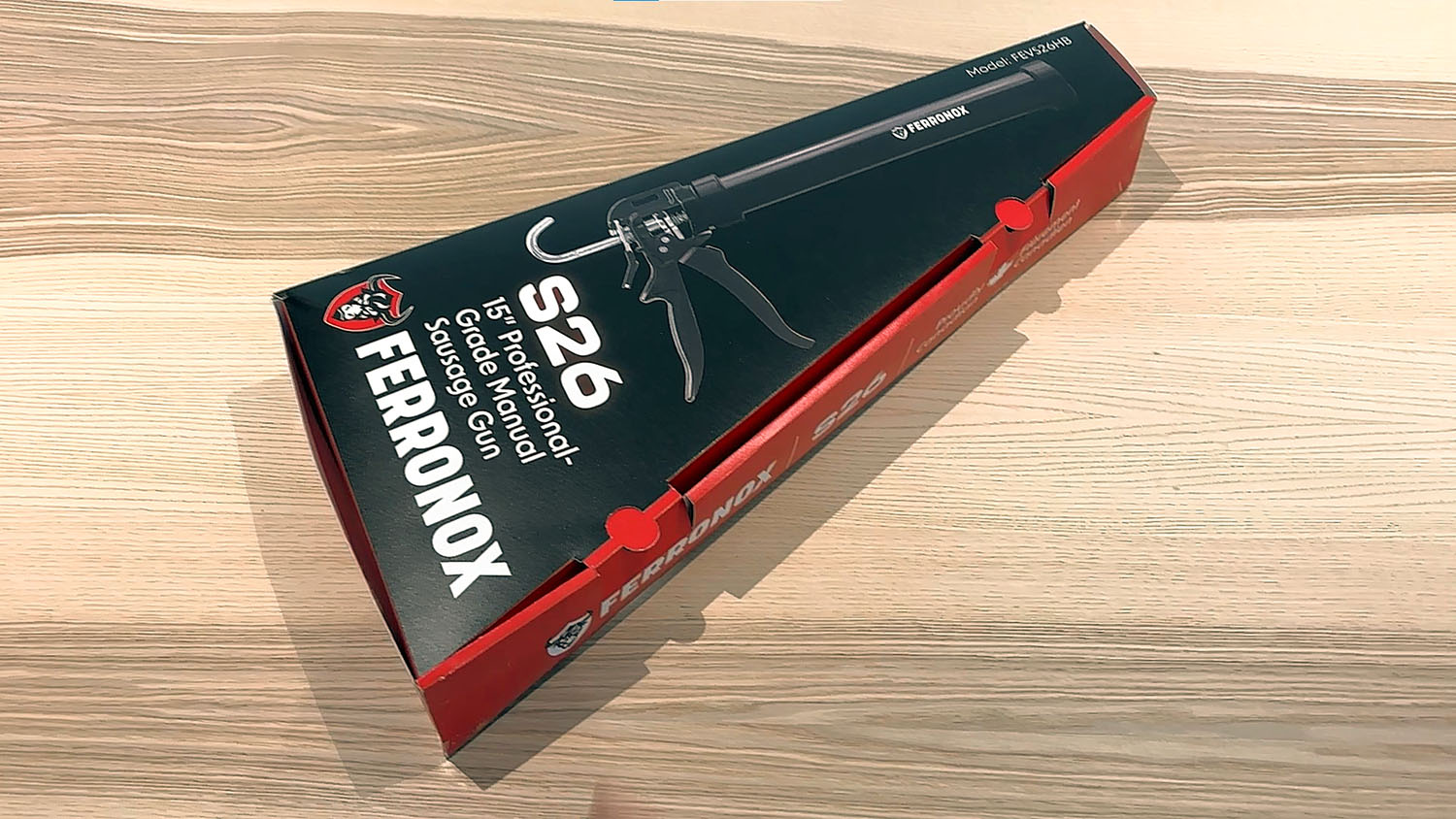
After the brochure, we started thinking about how we are going to package the products. I requested the design intern to create a concept sketch for an angular caulking gun package prior to starting any digital work. I also taught them to work on cocepts that are conceptually different from each other and give a rationale for the preferred solution. Such critical thinking and intentional design helped the designer present their ideas with confidence later that year. The design intern’s unique layout solution reinforced the use of Red and paved way for the pre-production design review.
Collaboration
In the new year, the priority project was to complete 13 cardboard inserts for a lineup of smaller specialty caulking tools before a tradeshow in March. Instead of directing just one person, I now had two creatives on my team who could assist with production and some creative work. With so many moving parts, I used the lessons learned and strategies from last year’s projects to develop a work-back schedule along with a focused, assembly line style workflow. Each team member focused on a specific task based on their strength while updating an Excel dashboard that helped the company founder understand the status of the project at any given time.
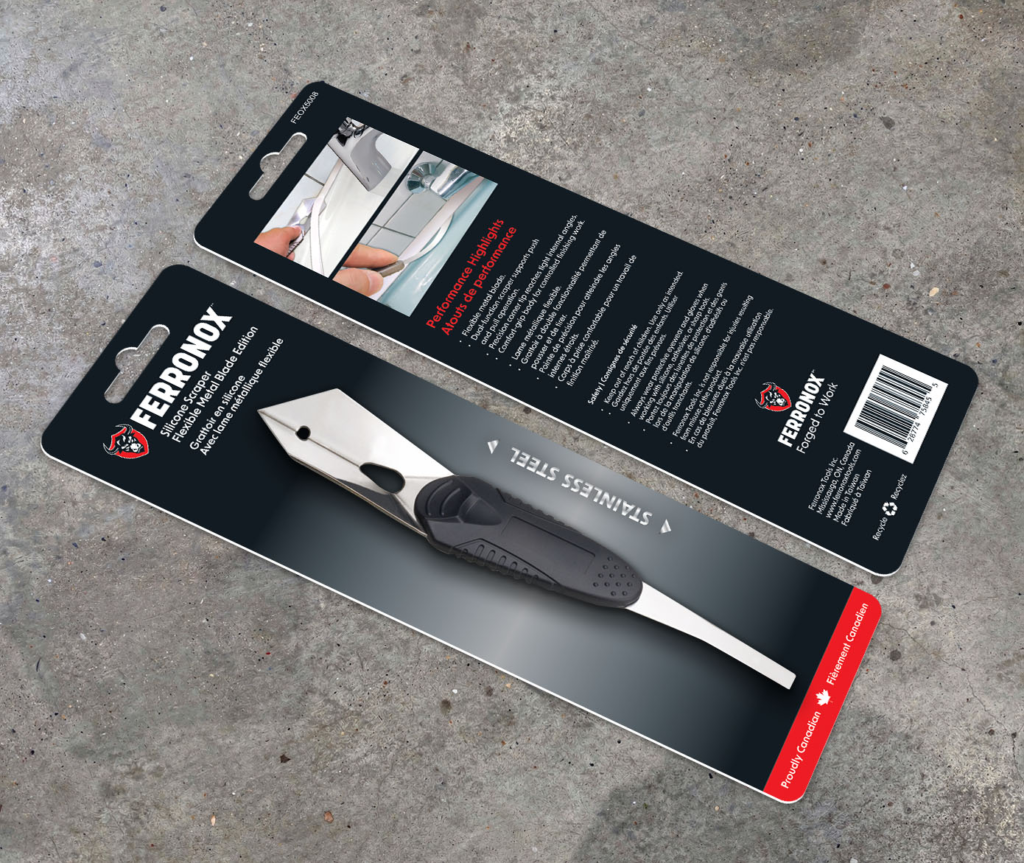
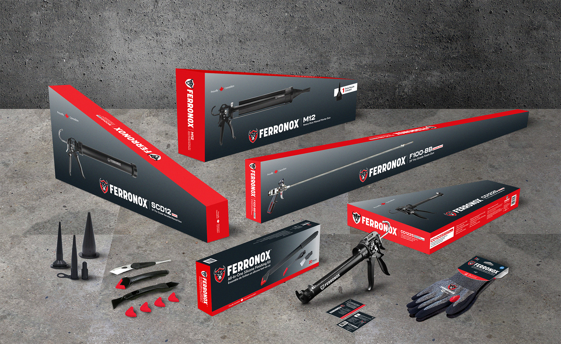
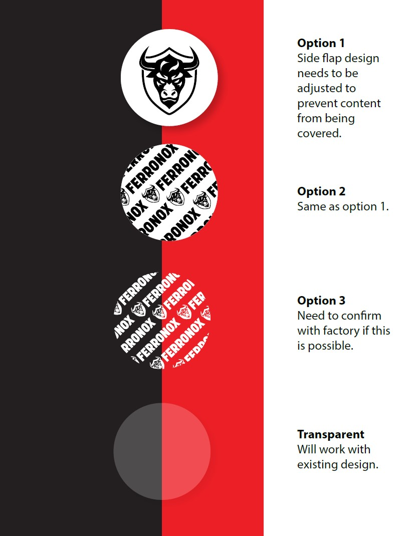
Cardboard Insert Packaging: There was an issue with Black coloured tools having poor contrast against a solid Black background. The blister packaging (removed from image above)made the tool even harder to see. The solution to use a gradient, as suggested by one of the Marketing team members, was a huge success and soon became a part of the entire packaging system.
By not doing all the work myself, I was able to let go of most of the details which was a huge leap in my development as a leader. This approach allowed the team members to make design decisions by themselves and own their part of the project. My contributions helped ensure that:
- the design was consistent across all products
- the leadership team always had clear expectations and up to date project status
- the team felt guided and working towards attainable goals