In-House Direction
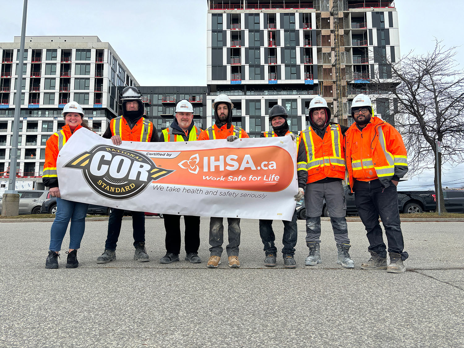
The COR certification is a huge achievement. It is something that each construction company should be very proud of. COR mailed us a banner and asked to take a photo of the team holding it up. We debated the location and settled on the Verge Condos. The crews wrapped up around 2pm and I was asked to drive to the site and direct the photoshoot. But first, I had to design a logo. As I feverishly pushed pixels in the comfort of a warm office and questioned my priorities, a team of seven waited, and waited in frigid temperatures for the photographer to arrive. I knew that there is no way that I could get them all to smile. The logo got approved the same day. The group photo barely made it to social media. Good thing I remembered to grab that banner!
Field Reporting
I was assigned to cover and report on a quality control procedure conducted in one of the buildings that the crews were working on. This challenge put my versatility to the test as I had to learn, interview, document, video edit, and write to produce the final social media piece. Together with the VP of Marketing, we prepared interview questions, a shot list, and a storyboard for the video so that I could make the best use of the time I had on hand.
With this being the first video after a major restructuring of the Marketing department at NCI, I had to audit past work and choose a practical style that would be quick to execute. To further optimize the production process for a busy team of two, I moved away from Adobe Premier and migrated to Canva. It was the right decision because it allowed for anyone on our growing team to edit and export a video file with ease.
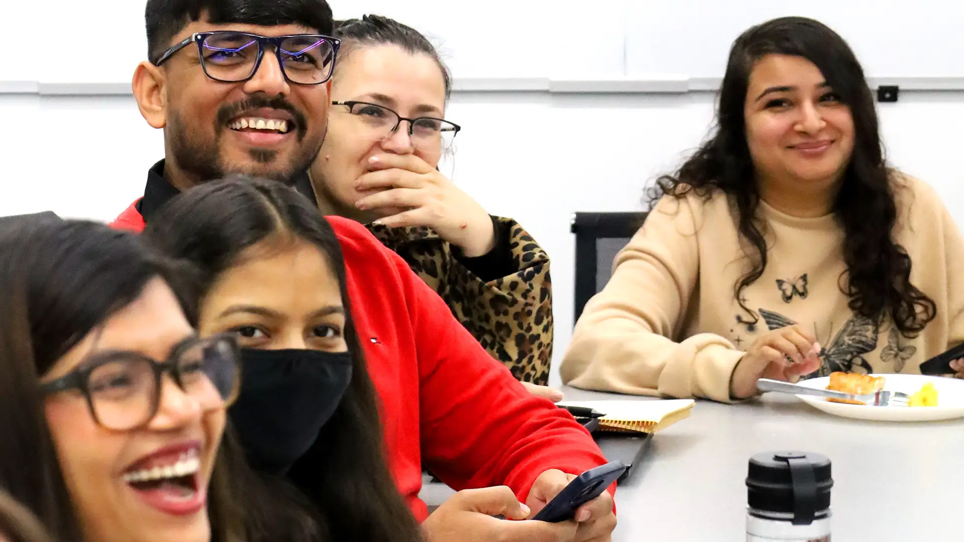
Social Media Video: We visited multiple floors of a residential building that was under construction in order to gather footage for the social media clip.
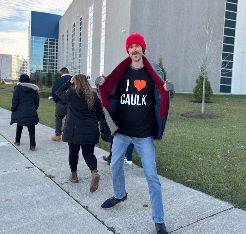
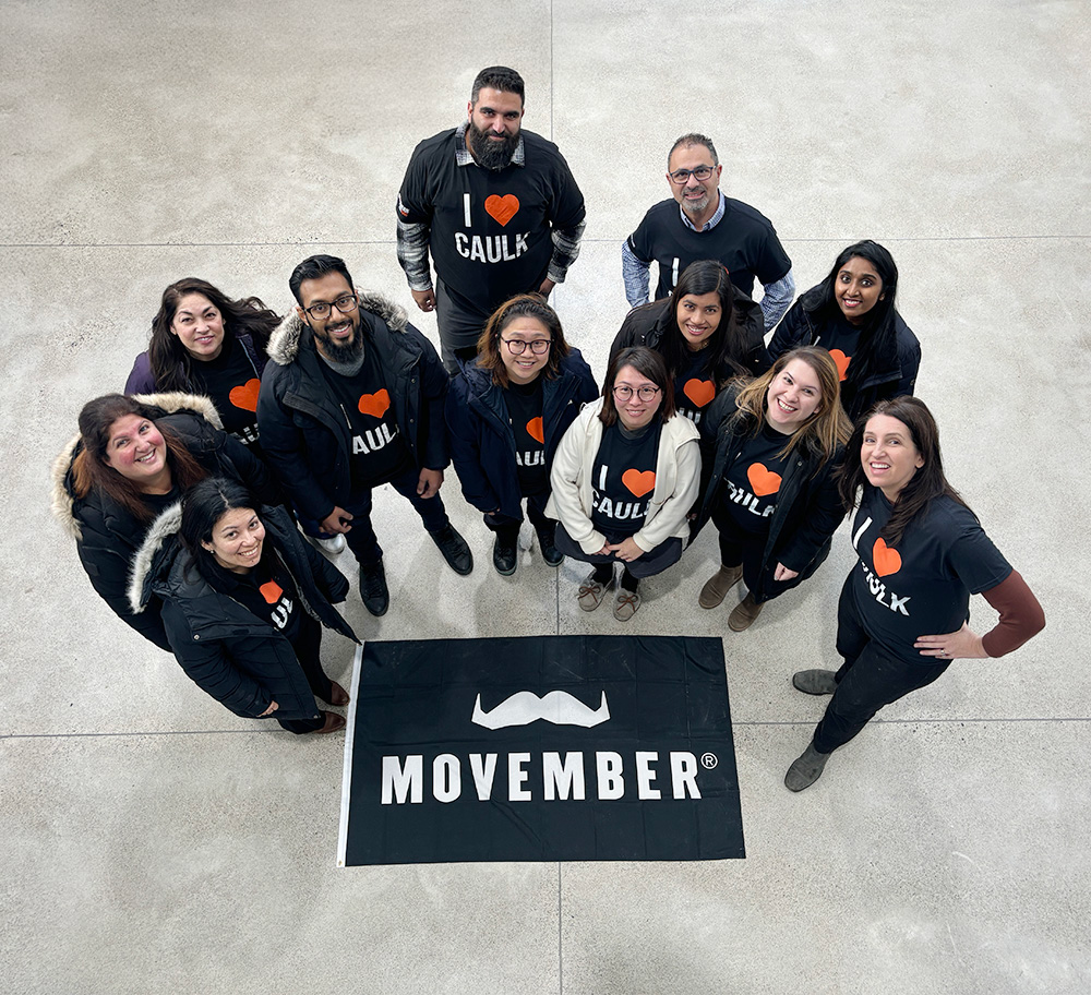
Movember Campaign
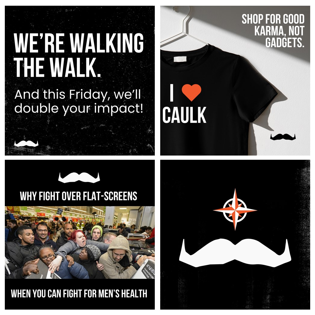
Since most of the workforce in the construction industry is made up of men, it was very fitting for NCI to work with the Movember Foundation. As the campaign lead and team captain, I collaborated with a Movember rep to give a lunch-and-learn presentation for our staff and build internal awareness. I also designed and launched a custom coded HTML email signature with a linked banner to drive external traffic to the Movember donation page. After a team walk, we followed up with a social media recap post and a group photo that I directed (see below).
To help our staff get started with fundraising, I experimented with a few emails and text messages, and then shared the successful ones as templates. Towards the end of the month, we paired the Movember campaign with Black Friday and created a humorous narrative on social media to help support the company’s donation matching. That year, our team raised over $5K and had almost 50% participation.
Event Photography: As a member of the marketing team, I have to always monitor what is going on around the office and be ready at a moment’s notice to document an event or frame a photograph that reinforces our culture and can be shared both internally and externally.
In-House Design Studio
Over the course of a few months, our small but mighty marketing team developed a visual identity and a website for each of the two newly formed sister companies. The VP of Marketing provided the content and I sourced the imagery and developed both websites using Elementor. With no prior knowledge of Elementor, I had to learn it and master it from ground zero.
Premium Wall Panels
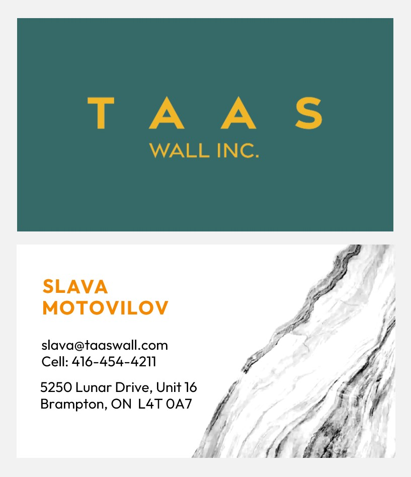
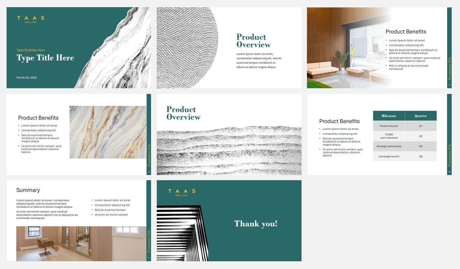
After presenting three logo options to the team and settling on a safe solution, we refined the colour palette and designed business cards, a slide deck template, and a set of four graphic devices. Due to a tight timeline, we only developed the essential marketing collateral required for acquiring new business.
The four founders of the company have various cultural backgrounds, and I wanted to encapsulate that in the visual identity. Even though the design that carried this concept did not get chosen, the idea lived on in the high contrast IvyMode that was selected for website headings.
Website Design: We had a lot to say about the new company and one of the biggest challenges was trimming down the content and creating a balance between images and text. The solution was to establish clear hierarchy by pairing fonts, fine tuning font sizing, and using accent colours.
Large-Scale Building Insulation
Building on the lessons learned from prior branding projects, our team of two moved on to the next sister company that, fortunately, only required a logo and a web presence. To meet the tight deadline, we strategically decided to work with an existing website design template that I already developed, tested, and received approval for.
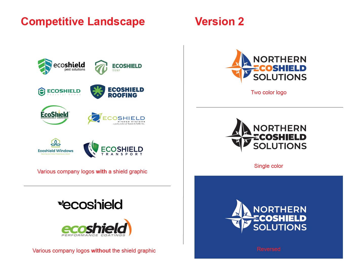
Our client had a very clear vision of how they wanted their logo to look like, and the challenge was to turn it into something functional and presentable in an extremely short period of time. In order to convince the team on avoiding the overused shield graphic, we researched logos of companies that have the same name and put together a PDF slide to drive the point home. The slide worked and the team agreed not to use the shield.
Website Design: I created a low-fi wireframe using tables in Microsoft Word before laying anything out on a web page. This approach made it easier for the VP of Marketing to comment directly in Microsoft Word and even adjust the layout instead of relying on third party software.
Directing the Social Media Team
Social media communications have always been a core component of the NCI marketing strategy, that’s why we grew the team to help with content development. This change gave me an opportunity to step away from production and take on a different role. As a senior designer, I could focus on creative and art direction for our ever growing family of companies and help set the team up for success. The challenge was in the volume. With multiple companies simultaneously needing a voice online, we had to manage our newly expanded creative team to make sure that they are not spread too thin.
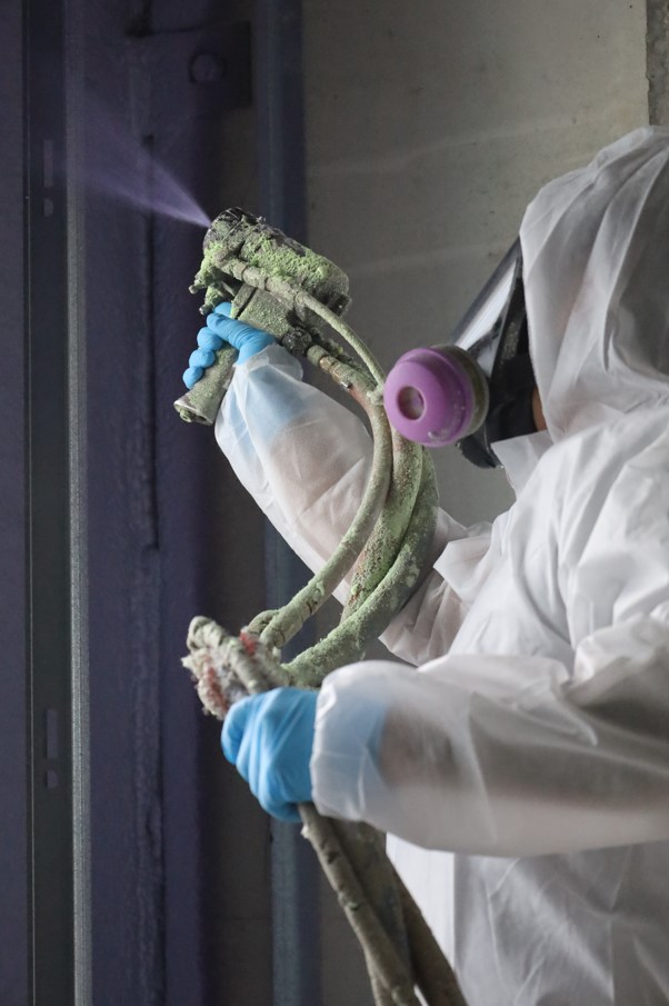
Art Direction for Social Media: I provided art direction during a site visit where we had to capture the process of spray foaming. Armed with a camera, coveralls, and half-face respirators, our goal was to capture dramatic shots with sci-fi flare, and record a time-lapse video of the foam expanding. (Video and copy crafted by Shalom Anna George)
To help the team make design decisions quickly, the VP of Marketing and I developed Quick Reference Guides (QRGs) for each of the companies that identified the visual standards such as fonts, colours, tone of voice, USP, and key messaging. Our QRGs helped to quickly get brand alignment and reduce required revisions during the review process, ultimately improving the team’s output. During the onboarding process, my “open door” approach allowed the new members of the team to ask me any questions at any point in time. This approach created a positive, guilt-free culture and built a strong foundation for our working relationship.
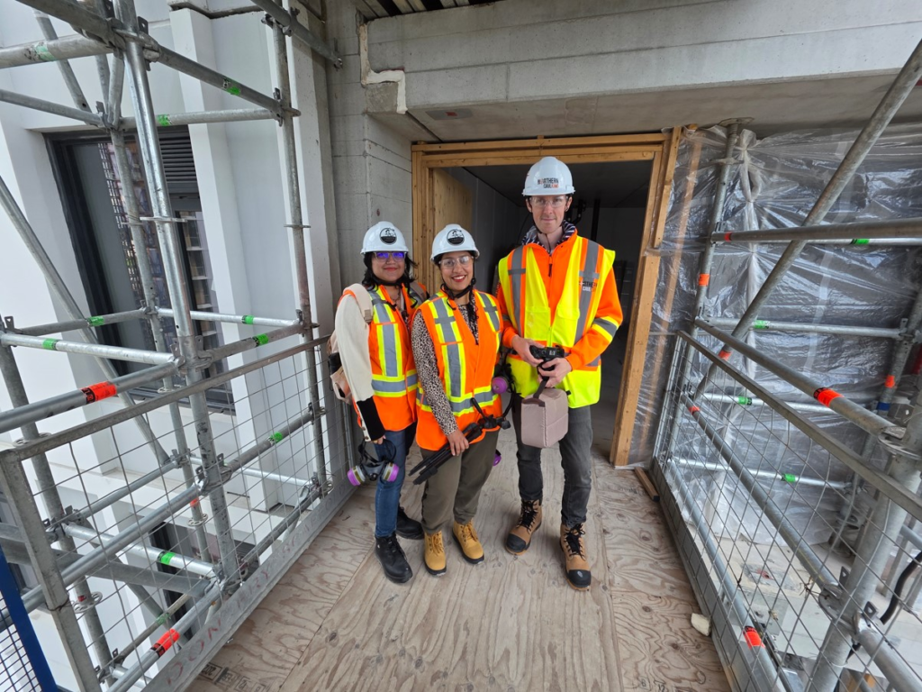
Building Team Rapport: Site visits like this provide an excellent opportunity to get to know your team while collaborating. Furthermore, everyone gets a first-hand experience of the industry and that inspires more accurate social media narratives.